Brand Brief: Well(ness) That's Beautiful!

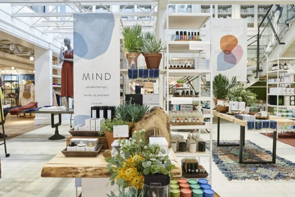
So last month Whole Foods got into the home decor game and I mentioned I thought it looked a bit like Anthropologie. Well this week Anthro set up The Wellness Shop. This shop within a shop opened earlier this week in 12 stores and online. The shop focuses on simple solutions for wellness mind, body and home. And true to the Anthro brand it includes a curated collection of beautiful products and niche brands.

These photos of in-store from Brit + Co. have me hoping that Milwaukee is on the short list to get one of the next Wellness Shops. The soft but earthy colors clean, light type feels like a palette you'd see at your trusted neighborhood yoga studio.

The Wellness Shop at Anthropologie

The Wellness Shop at Anthropologie

ANT_BEVHILLS_WELLNESS_2268-1-645x430.jpg
ANT_BEVHILLS_WELLNESS_2231-645x430.jpg

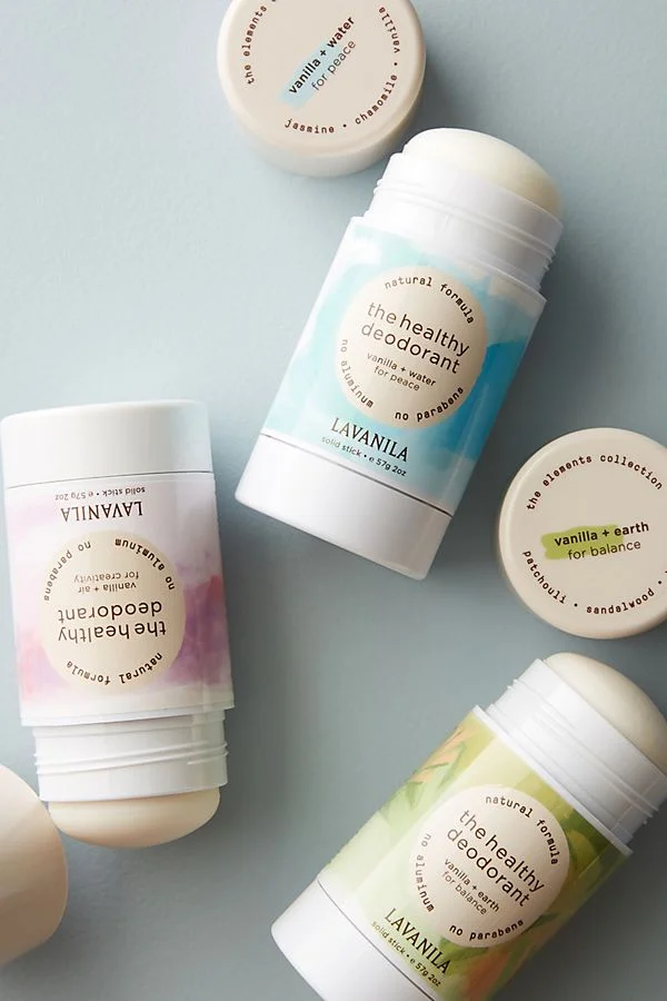
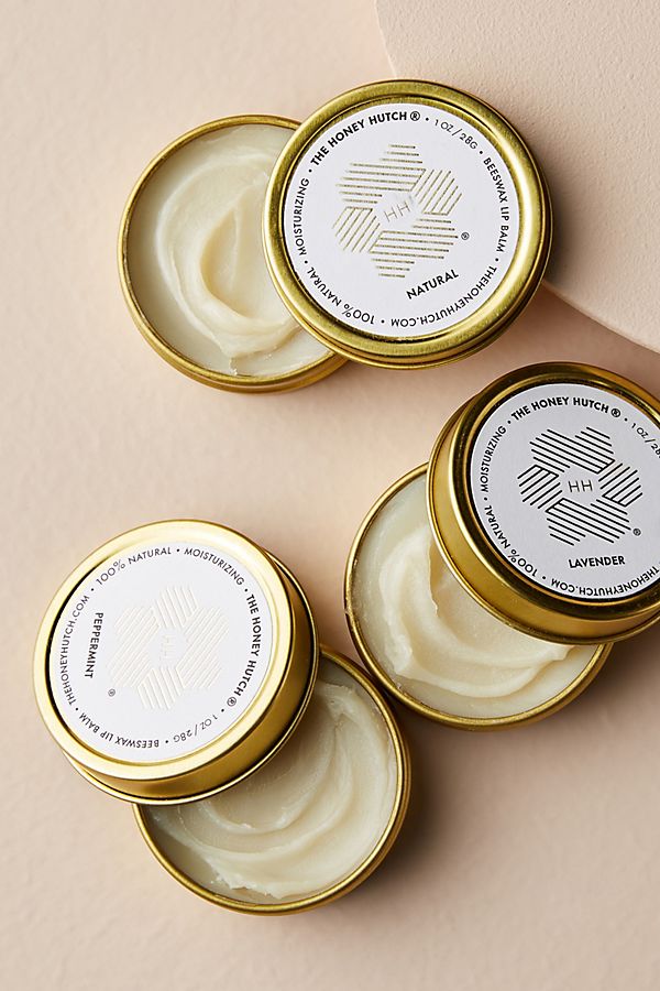
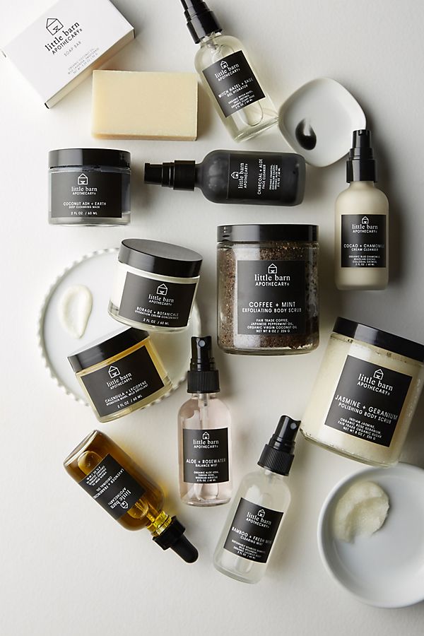
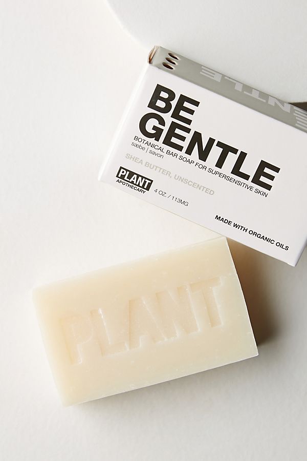
And I feel like I've just hit a jackpot of beautiful packaging inspiration. The products themselves are interesting (um, there are water bottles with infusing crystals and space cleansing kits with sage!) and the packaging ranges from natural and handcrafted-feeling to clean, bold and witty. I've highlighted just a few of my favs, but I had a hard time choosing.

Brand Brief: Everything Old Can Be New Again

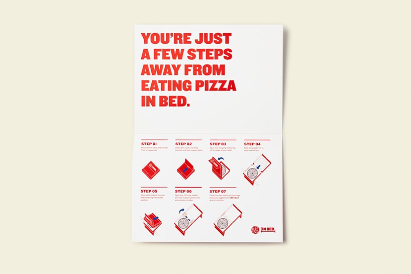
Seriously. And this one proves it. Because what packaging is older then a pizza box. (There's probably something, but anyway ...). A pizza place out of Canada wants you to be able to eat their pizza in bed. So they worked with John St. Advertising to design a pizza box that transforms into a tray. With legs. To hold the pizza OVER YOUR LAP. You can read all about it on DesignBoom.

Because why wouldn't you want to eat your pizza in bed?

Because why wouldn't you want to eat your pizza in bed?

So simple.

So simple.

Those little pizza locks are just so cute.

Those little pizza locks are just so cute.

Box_Instructions.jpg

But then there is the video ...

The first comment on the YouTube page deserves a gold star: "Its missing the cup holder tho". There's always room for improvement.

Fun Packaging Friday: Fire up the grill!

It's kind of gloomy here in Milwaukee today, but it's supposed to be hot and sunny this weekend. Which means grilling! And I stumbled across this new grilling tool brand and thought the identity and packaging design was unique, smart and fun.

IGNITE Grilling by CMA Design

IGNITE Grilling by CMA Design

First can we talk about that logo and tagline? Is a flame or a face? It's a memorable mark either way. And the spark on the reminds me of lighting the grill. But that tagline "Sear-iously Good Grilling" is pun-erific. This approach feels youthful and fun, different from the usual players in this market that use their experience in the space to engage customers (hello weber).

IGNITE Grilling by CMA Design

IGNITE Grilling by CMA Design

The IGNITE grilling brand and packaging was developed by CMA Design out of Texas. Again they differentiated the brand through color with the bold orange and blue combination, ignoring the traditional convention of red and black in the grilling space. The messaging is really clear and the layout is flexible enough to work across a number of different packaging formats without feeling forced or over-templated.

If you have a few minutes take a peek at this page on CMA Design's website. They break down their design process from starting with positioning and logo sketches to all the options they shared with their client to get approval on the final design.