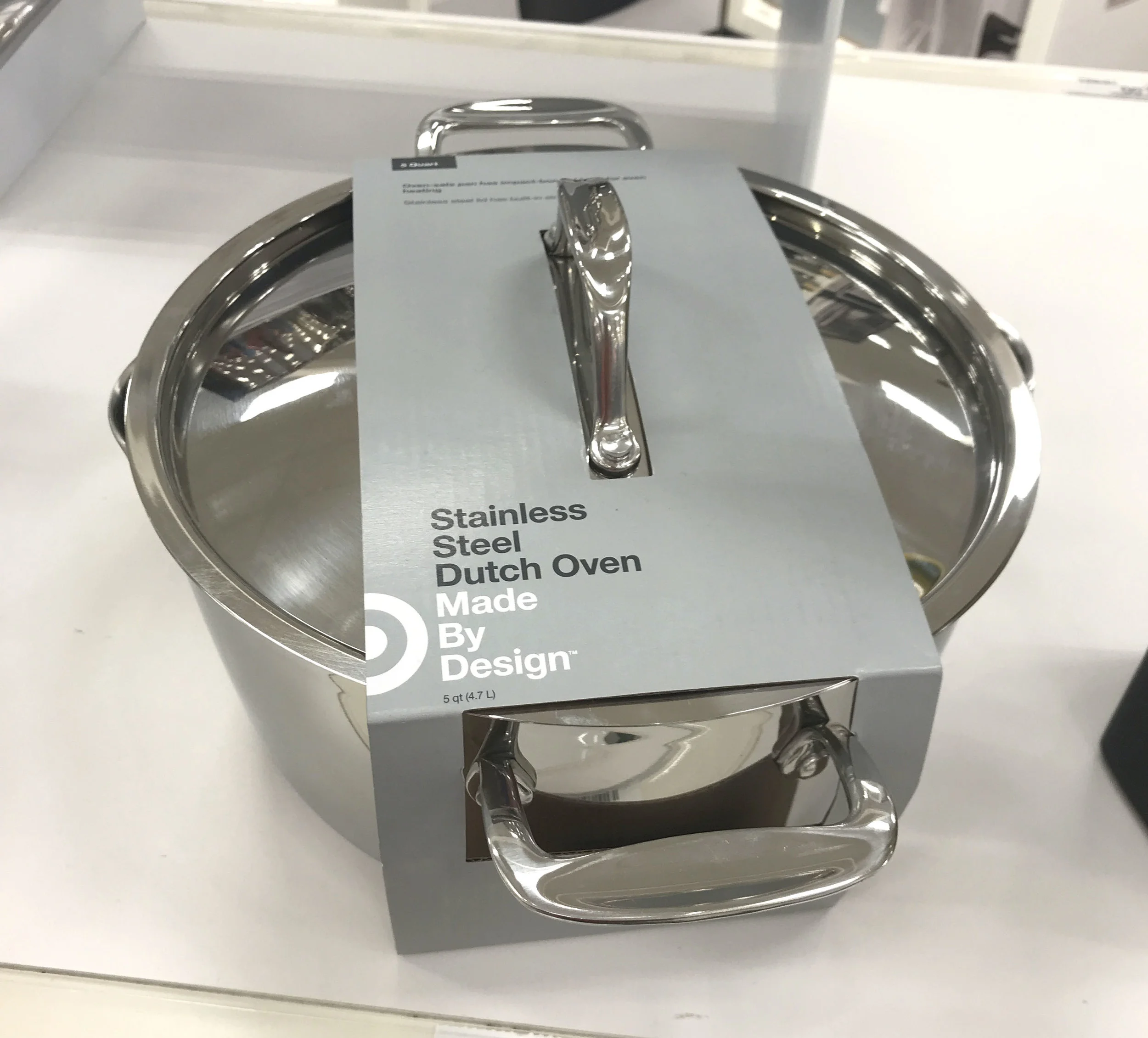
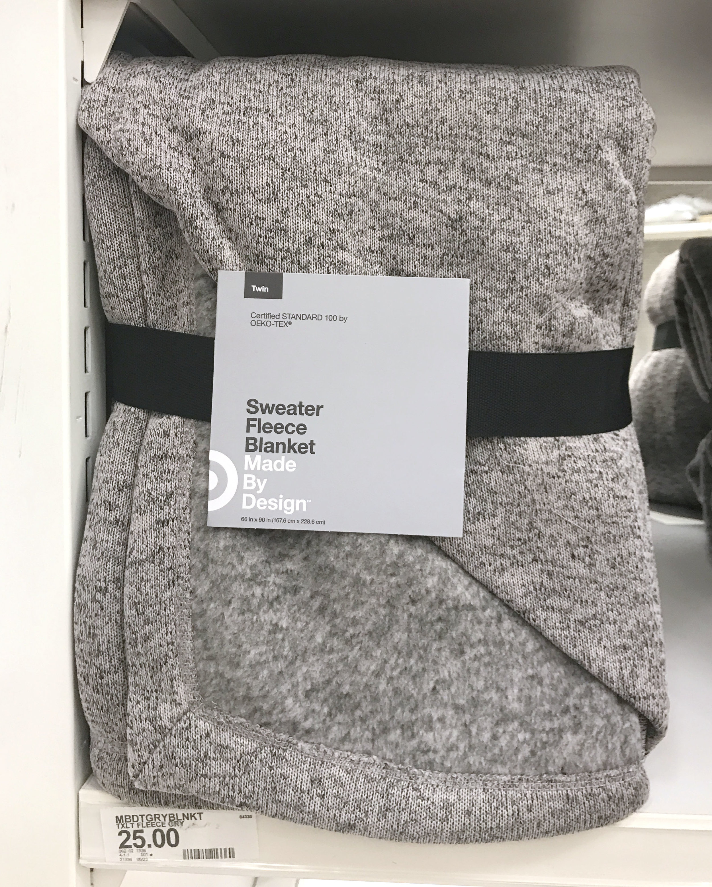
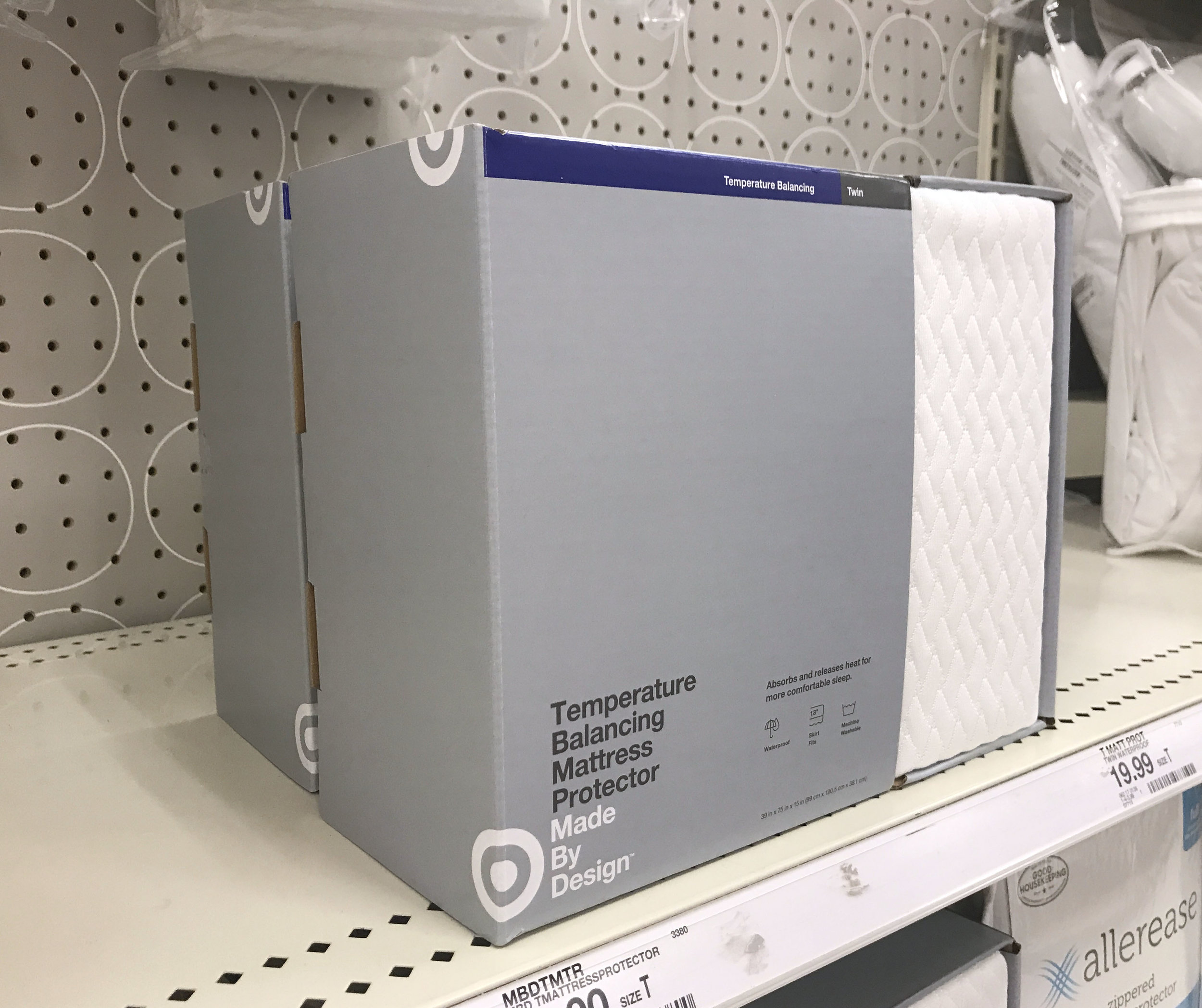
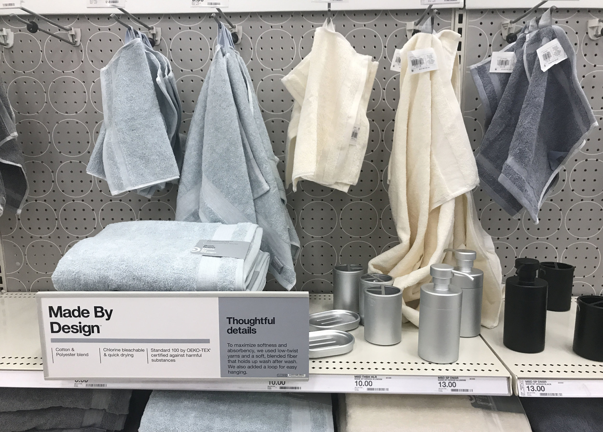
So, in case you missed it Target launched a new brand this week. And this time, it’s not a partnership with a famous designer. It’s the basics. It’s function and form. It’s simple and straight-forward. And it’s a Target-branded private brand.
Target has been known for making great design accessible. So why is this different? Because it’s designed to be functional first. Target Made by Design is a line of household basics created to work at a price point that works too. These are the products you need but Target gave them each a thoughtful benefit for the customer and a simple, timeless design that will compliment any style. Then counter to the philosophy of a “private brand” Target incorporated their brand name and logo into their private brand.


The packaging design itself is clean and Swiss Style influenced, but that is not new for Target. The messaging hierarchy is strong and clear making it easy to digest the product information quickly. The foundations of the messaging are short and sweet product names and one carefully chosen product feature, getting to the key reason to buy right away instead of overloading the customer with information. And somehow they have managed to choose the perfect shade of gray. Not too warm. Not too cool. And perfect contrast and legibility for both black and white text. Even the packaging is leading with function by focusing on the communication.

When it comes to developing private brands, it's long been the trend to develop a unique, differentiated positioning and product assortment that is proprietary to the retailer but is not immediately recognizable as being store-owned. This helps create credibility for each private brand and allows the flexibility for brands to speak to different customers within the same space. Again Target is breaking the mold here by connecting their Target Bullseye to the Made By Design brand. And it makes sense. The low price and high-functionality of this product line is separate from the design-focused product Target typically produces, to the Target mark helps to certify for the customer that this product is still design-savvy even at the low price.
This is truly a brand that was built on a strong foundation of positioning and strategy that has influenced every decision. From the simple, functional product to the clean and considered packaging design it’s clear that every detail was considered. There is a great article on the whys behind these decisions and the process on Fast Co. Design.